

Case · Telecoms · Naming and identity
LigaT
A fibre and mobile operator in Portugal that wanted to take on the big players by speaking plainly.
- Client
- LigaT · Portugal
- Sector
- Telecoms · Fibre and mobile
- Scope
- Naming · Verbal and visual identity · Guidelines ES/PT · Applications
- Creative direction
- Santi Sanz
- Year
- 2022
The challenge
In telecoms every tariff looks alike and every contract is a chore.
A new operator had to look simple before quoting a single tariff.
The frame
Se é simples, é melhor.
A name that in Portuguese already says what it does, and a tone that talks like a neighbour, not a phone company.
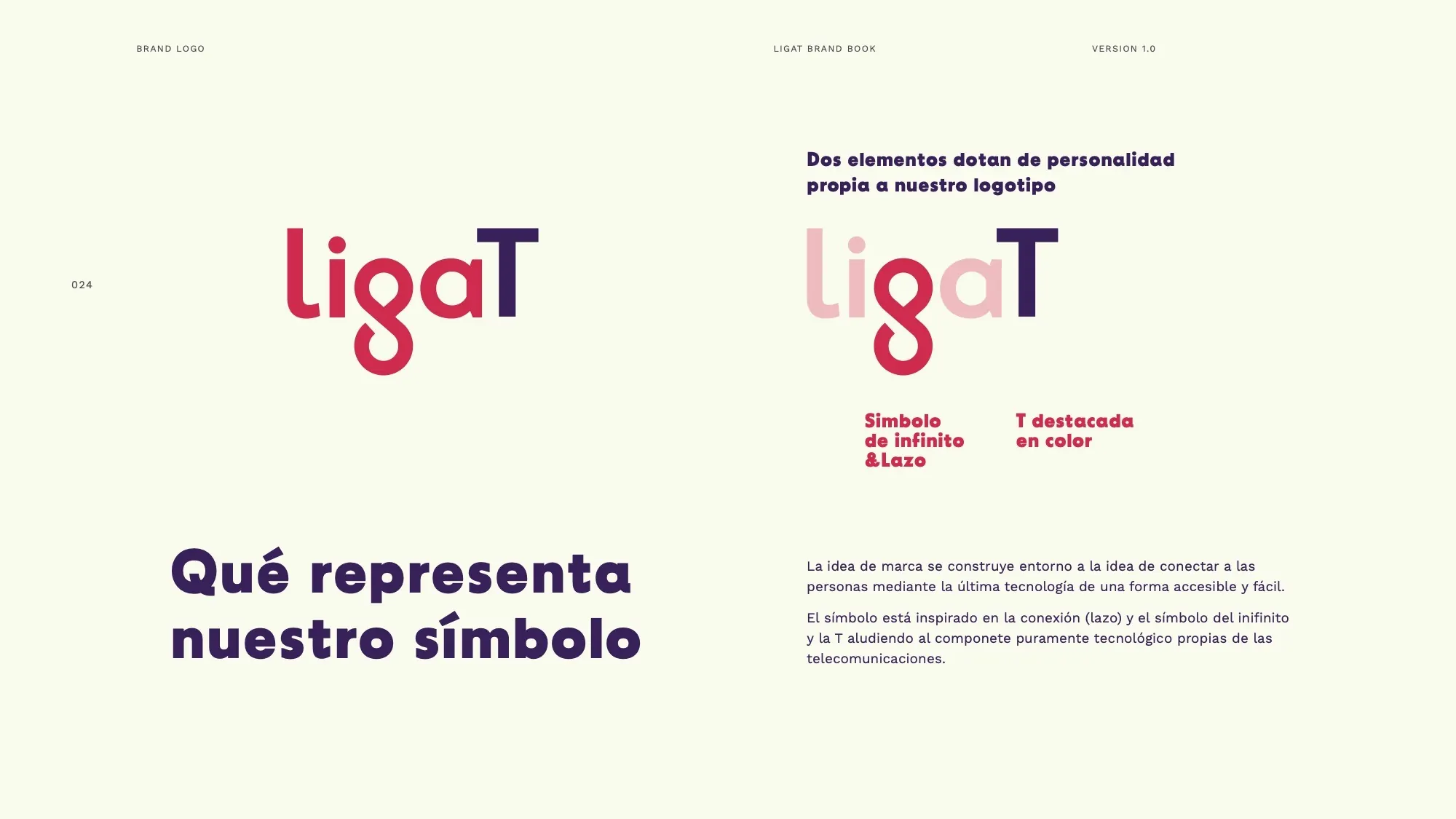
- Naming: LigaT, from “ligar” (to connect) and the T for technology
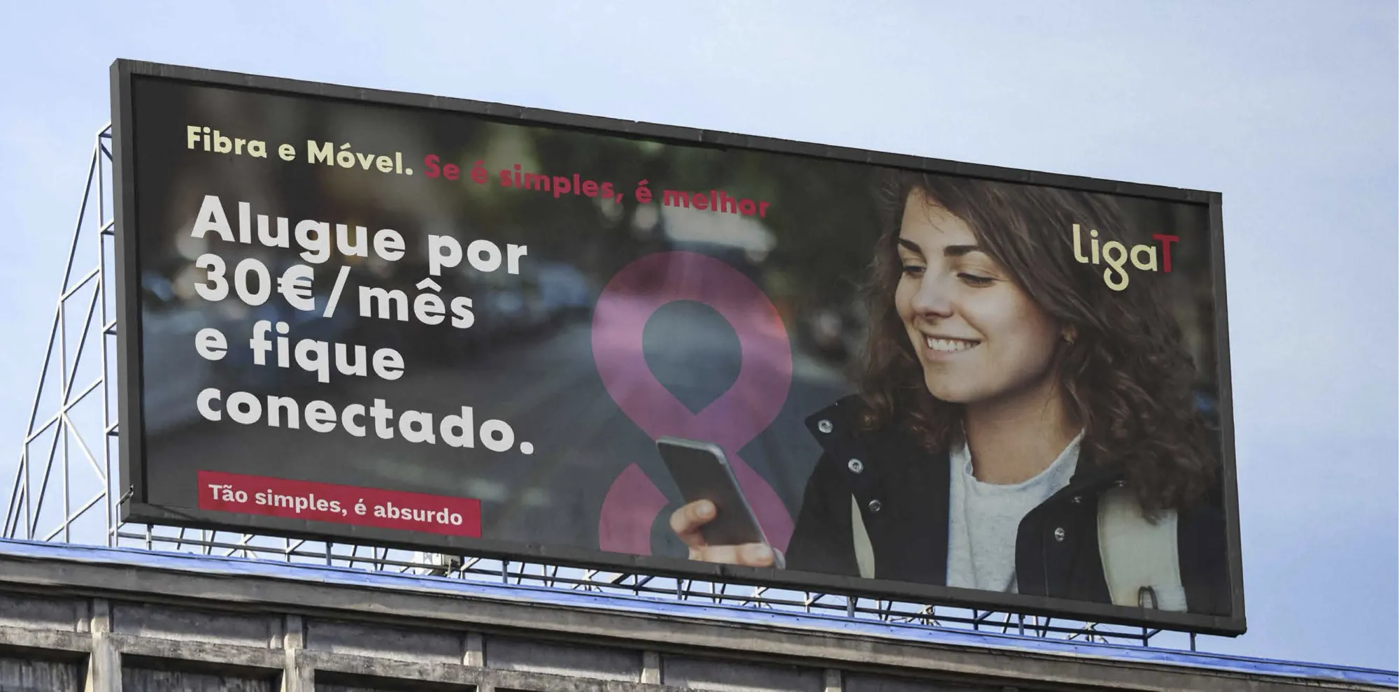
- Slogan: “Fibra e Móvel. Se é simples, é melhor”
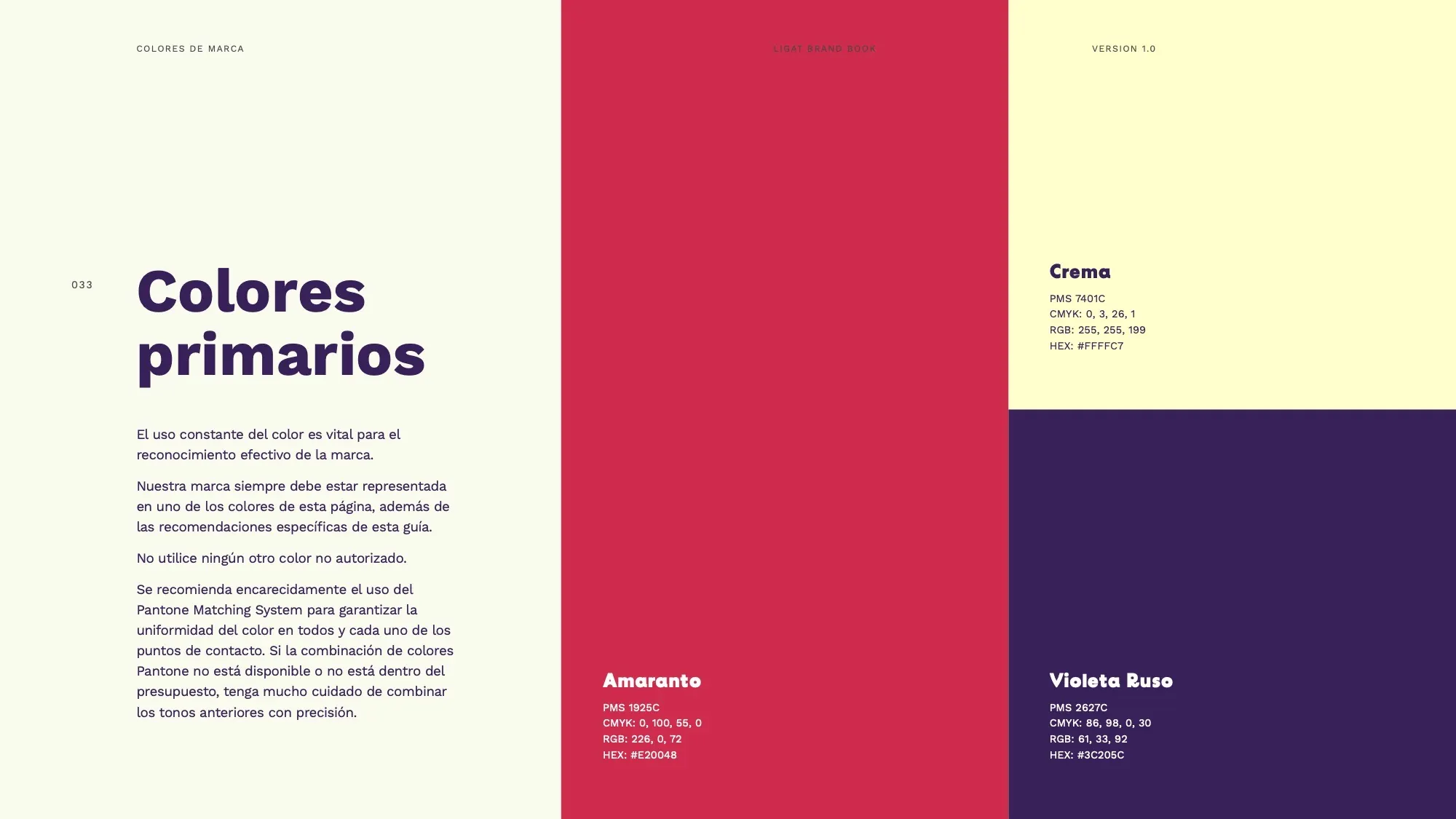
- Visual identity and brand guidelines in Spanish and Portuguese (2022)
- Cards, leaflet, investor presentation and email signature
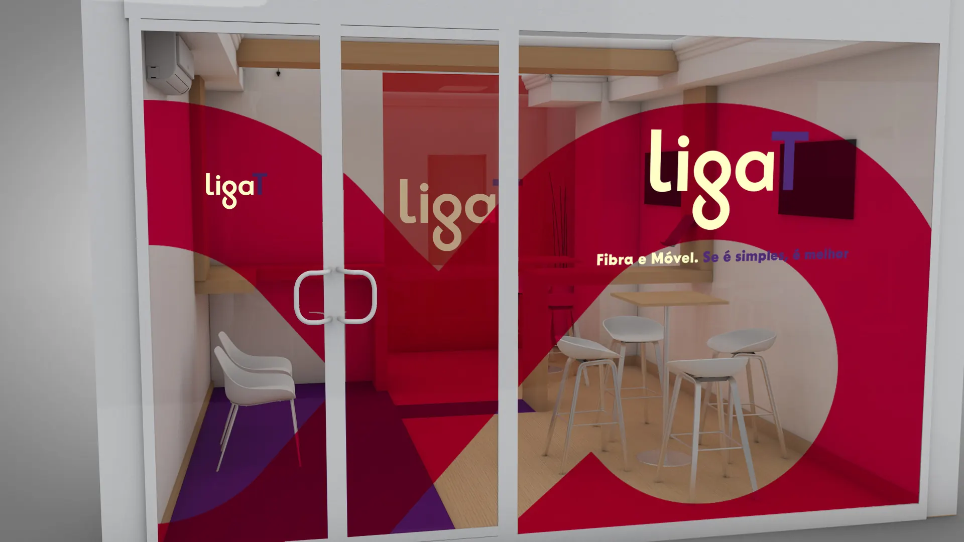
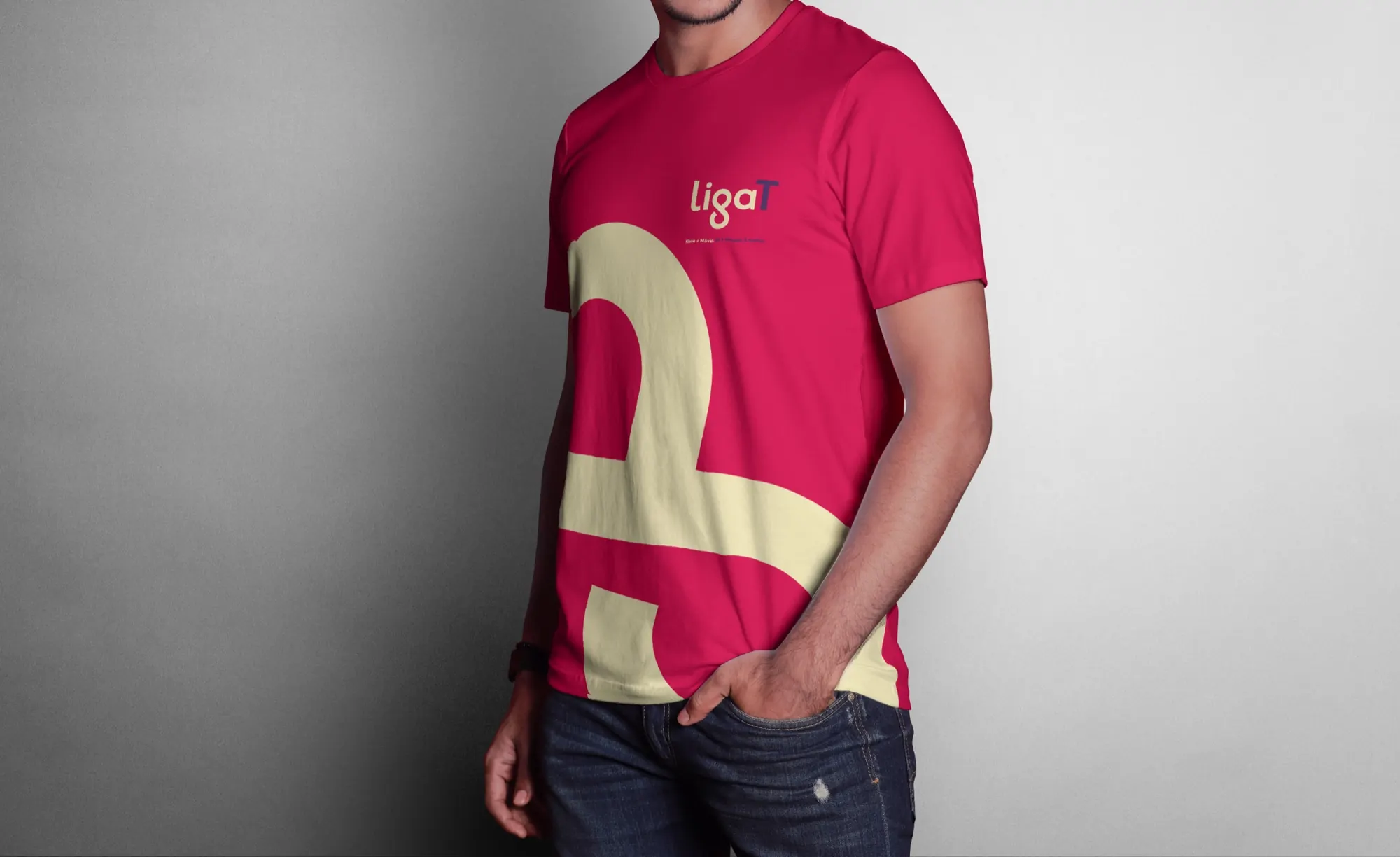
- Clothing for team and technicians, gift packaging and shop graphics
- Social media campaigns: “Embaixador” and “Pioneiro”

Video · The brand in use
The result
A short name, a slogan you get first time and a system ready for a shop, a van or a technician's overalls.